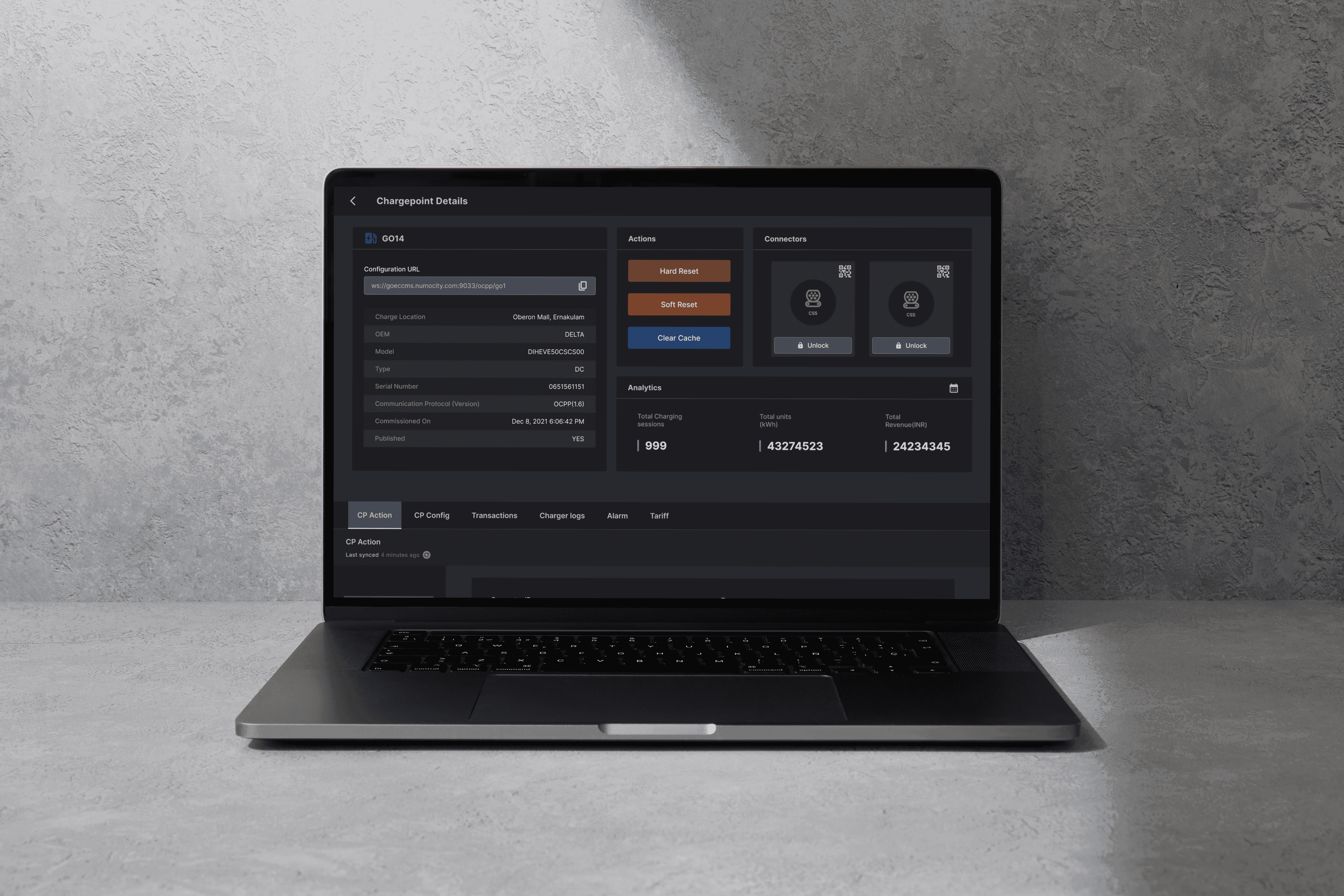
Multi-Entity EdTech Platform
A competitive exam prep platform that follows students from practice to admission decisions.
Role
Sole Product Designer
Software used
Figma · FigJam · Notion
Duration
1 year, Ongoing
The system, at a glance
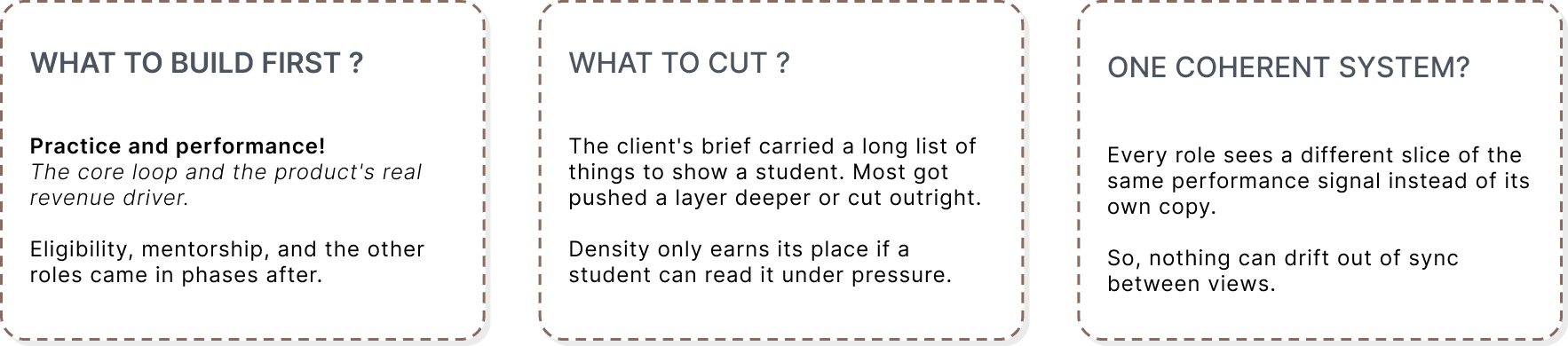
Five roles: Student, Teacher, Mentor, Parent, and Admin ; each with a different slice of the same underlying system.
Open Questions
Role | Needs | Pain Point |
|---|---|---|
Student | Improve , then choose the right course | Anxiety about time; unclear what to fix next |
Parent | Stay Informed | Visibility without turning into surveillance |
Teacher | Author accurate test content efficiently and clear doubts | Need real tools, not a content dump |
Mentor | Guide specific students | Oversight without micromanaging |
Admin | Make sure the platform runs smoothly | Needs context rather than a full CRM |
One stream of practice data, summarised differently for five different audiences .That's the main thread. This case study focus mainly on the student experience specifically. This is where the real design judgment happened and treats the other four roles as the context they were designed around.
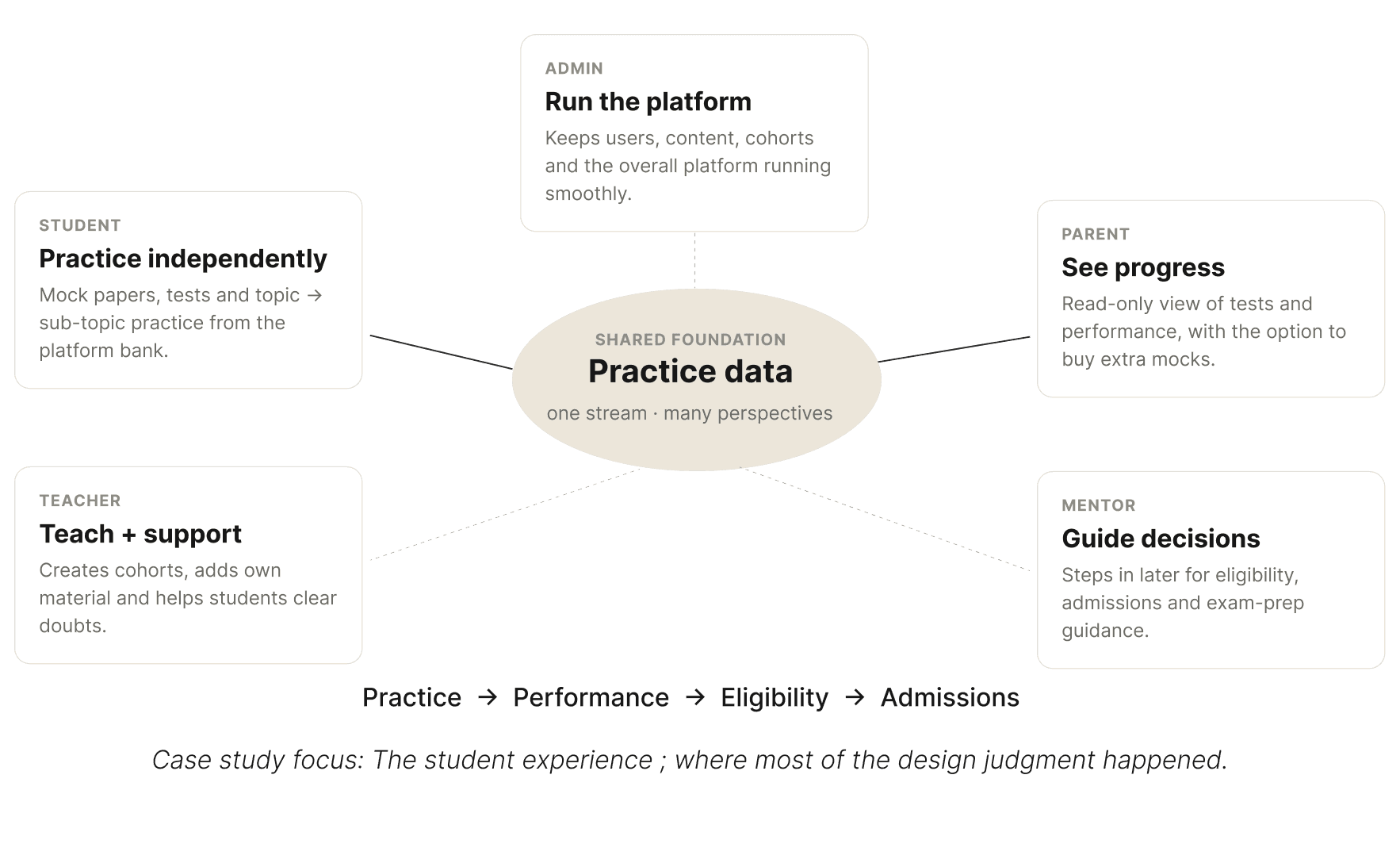
System Architecture
Principles that guided every decision
Three rules recur across every module, regardless of which role the screen served:
"Improvement area," never "you're bad at this." A high-anxiety product needs a calm register ; weaknesses read as something to work on, a bad week reads as quieter than usual, never as a warning.
Clarity over volume. One clear next action, never a wall of stats, especially anywhere a student or parent is looking.
Role-appropriate density. Student- and parent-facing views stay simple and low-density. Teacher and admin views can hold denser tools, because those users are working, not coping.
01 - Designing depth that a stressed 17-year-old can actually read
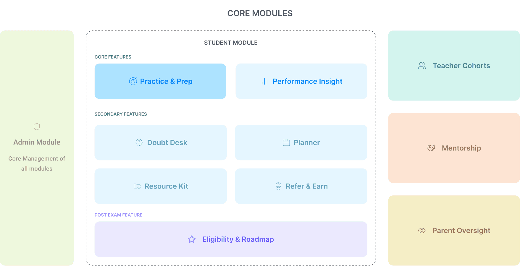
Core of the product and the revenue generating part of the product is the Tests & Performance section. Performance insight was meant to shift a student from passive question-answering to active, data-driven prep.
Problem: A student mid-exam-prep is anxious, and a dashboard that reads their weak areas back to them coldly can do real harm.
The harder part wasn't deciding what to include.It was resisting the pull to show all of it at once.
Challenge one: Too much data, not enough judgment.
The client came in with an extensive list of parameters they wanted analysed, far more than could be shown without overwhelming a student.
The real design work wasn't building dashboards for all of it; it was deciding what actually earned a place in front of a student and what was just noise.
Challenge two: How do you actually lay this out?
Cutting the list down solved one problem and created the next;
The choice of representation, whether a chart, a graph, or a simpler stat, had to make dense information feel approachable rather than clinical to someone reading it under exam-pressure stress. Early layouts kept drifting toward showing everything at once, and pulling that back was a recurring argument, not a one-time call.
02 - Building the one place that replaces ten browser tabs
Problem: The old way students figured out where they stood: one tab for eligibility criteria, another for a forum thread on cutoffs, a third for a university's own admissions page ; guesswork stitching it together.
The platform attempted to solve this gap.
Entry point: Just basic info and a class 12 percentage.No test data required to start.
Performance data: Once it exists, sharpens the picture further, but was never the gate.
The real Challenge: Trust, not mechanics .The module only earns its keep if it's more reliable than piecing information together yourself.
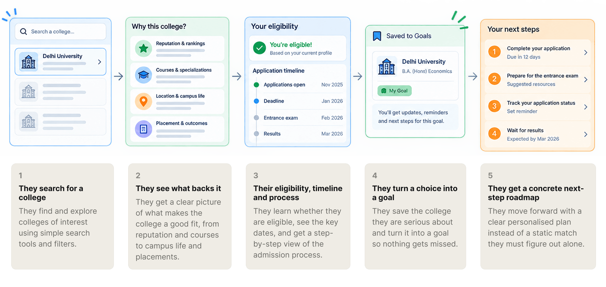
From Search to a clear Next Step
Students can go from browsing colleges to a personalised roadmap; with the right information in the right order.
The othe roles, briefly
Parent Dashboard
The brief is explicit that parent dashboard is read-only and not a mirror of the student's account.
The design challenge was building a genuinely useful first-read screen without making it a monitory-level detail. A deliberate call to keep a support feature from quietly becoming surveillance.
Kept on the Dashboard | Left for deeper student activity page |
|---|---|
One score/percentile + a trend word (" Improving", "Steady") | Full Subject wise score table |
Last 3 Test scores + Trends | Per Question detail of tests |
No Goal setting | |
Leaderboard/ Platform Ranking |
Teacher Dashboard
Teacher gets the content behind the practice .Building and managing the question banks, tests, and chapter tags that feed the student practice loop, reusing the platform's own test-authoring flow rather than building a second one. The discipline here was to keep platform-provided and teacher-provided content clearly separated even though both run through the same pipeline.
Mentor Dashboard
Mentor gets a light read of a student's recent performance, not the full dashboard. Just enough to start a conversation. Add a chat and call channel, and a place to log notes .That's the whole tool. The team kept it light on purpose, and had to defend that choice more than once against the instinct to build more.
Four instincts carried across every module:
Ground every decision in what exists. Screens started from a real flow wherever one existed .
Name the scope creep. When something got bigger than it should, that got said out loud, not absorbed quietly .More than once, the answer was to cut it down or push it to the next phase, not force it through in one pass.
Protect a single source of truth. One performance signal, summarised differently per role, never duplicated .No two views can drift apart.
Let the emotional register do real work. Tone wasn't polish added at the end .It shaped which data appeared at all.
One question stays open: whether the business logic has been thought through as rigorously as the design. I don't know yet . A fair place to be, a year in.
Some visuals have been recreated or genericized to respect an NDA. The decisions described are accurate.